


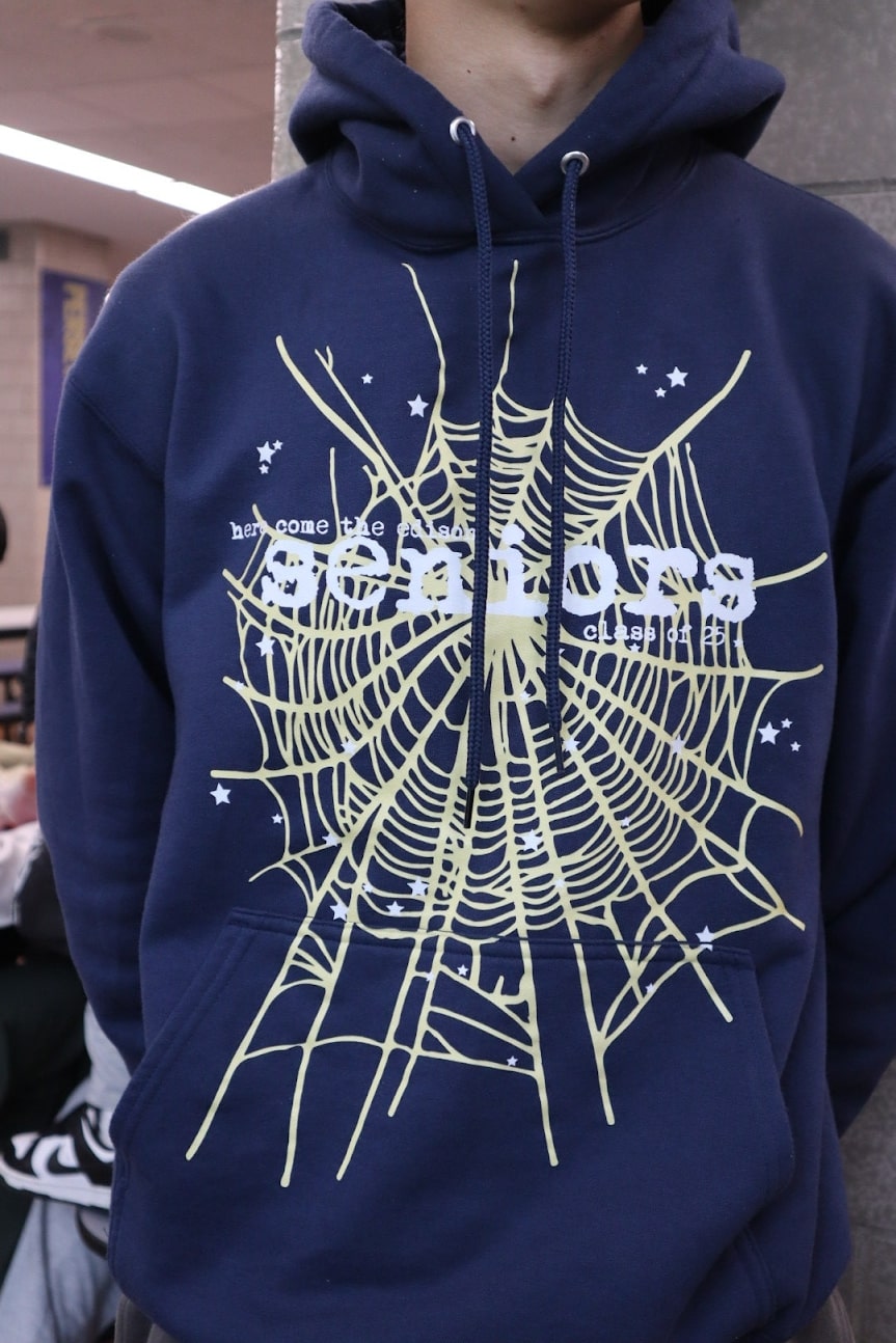
As the 2025 school year comes to an end, it marks the stepping up of seniors here at Edison. That also means they will receive their diplomas, graduation caps and gowns, and Senior Hoodie.
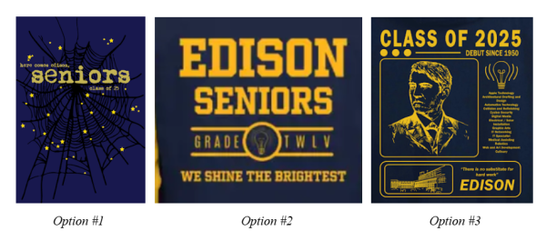
On April 4th of 2025, the deadline for Senior Dues had arrived, and on April 28th, the hoodies were ready for pickup. Before this date, a survey was put in place to choose the design of the senior hoodie. On the survey, there were three design choices for the hoodie, which were created by students here at Edison.
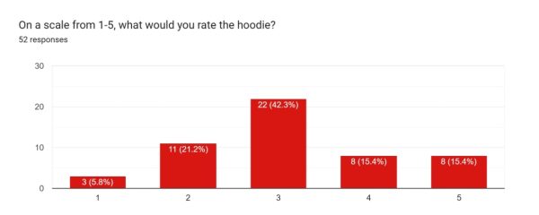
The winning design for the hoodie received 121 votes, 60.5% of the votes. The second option received 17 votes, 8.5% of the votes, and the third option received 62 votes, which was 31% of the votes. The total number of votes doesn’t nearly match the number of seniors here at Edison. There were 200 votes, while there were around 489 students in the 12th grade. This meant that less than half of the senior population decided to vote for which design they preferred. Despite this, the design choice was highly controversial based on a survey conducted towards Seniors who received the hoodie, although many abstained from the voting process in the first place.
“I like the font of the text on the hoodie however I don’t like the design of the hoodie as I feel like it doesn’t represent [Edison] that well and every other school is doing the same type of spider design,” said Abrar Kazi Muttaki.
This student rated the hoodie 2 stars out of 5, however, they stated that they did not vote for any of the design options. They don’t seem to have a strong appeal towards the design of the hoodie for more reasons than one, mainly because they don’t believe it represents the school all that well. They also don’t appear to be a big fan of the ‘Sp5der’ like-design that this year’s senior hoodie was inspired by.

“I like how the design ended up looking like a spider web, something trendy and popular with our age group, while still symbolizing us as Edison seniors,” said Hayden Budhan.
This student rated the hoodie a 4 out of 5 stars; they quite liked the design of the hoodie and enjoyed the fact that it was up to date with the trends.
Many students believe that the design that was chosen was the best out of the 3 options that were given, or so we thought. There are just as many students who believe that it was not a good design.
“I kind of said all my dislikes about the winning design up in the other question. It had NOTHING going for it. Now it has a random big white or yellow spider web which makes the text even harder to see. The votes should’ve been redone if they were going to edit it without informing us. Genuinely questioning everyday why did we only get 3 to pick from I’m sure these were the worst ones. And the fact I couldn’t even pick to not pay for it in my senior dues makes me more mad that this design got picked,” said Queena Xin Zheng. This student rated this hoodie with 1 out of 5 stars.
“All of it needs to change, a lightbulb would be better than a web and stars. The text should’ve been bigger and font should be something legible. There should’ve been something to represent all the [CTE] classes or something that makes our school us.” This student expressed that these hoodie designs were the worst ones to choose from, and they should’ve given more options since three weren’t enough to give a consensus of the best hoodie.
“I like that the hoodie is big and comfortable on me. [However,] I dislike that it is just a copy of the sp5der brand, and I wouldn’t wear it outside because it’s embarrassing,” said Andres Grados. “I don’t want to wear a school copy of an actual popular and expensive brand in public.” He rated this hoodie at 2 stars out of 5. This student believes that the lack of originality kills the potential of the hoodie.
Many others also believe that the hoodie should’ve been more original. “I like the simplicity of the design, it’s very aesthetically pleasing, but I wasn’t too keen on the fact that it almost exactly looks like the pre-existed Spider hoodie. I wanted something more [original],” said Jada Primo.
“I didn’t like the way that color was organized on the hoodie. I felt like the spider web was messy and it didn’t seem original at all because of the fact there is a trending spider hoodie with the same design. Additionally, you can barely see “Here comes Edison Seniors” and the color was white and tiny. I felt like because the back had nothing on it either, it was very basic and NOT a senior hoodie at all,” said Ellianna Colimon.
“I dislike how it looks similar to a brand that already exists. This design has nothing to do with our school or image. It’s a trendy design now, but it won’t make sense later on as trends fade,” said Jannatul Begum.
Many students believe that out of all the designs, this was the best one. And other students believe that there could’ve been a better hoodie selected for the price they paid.